

OVERDRIVE
energy drink brand creation
OVERVIEW
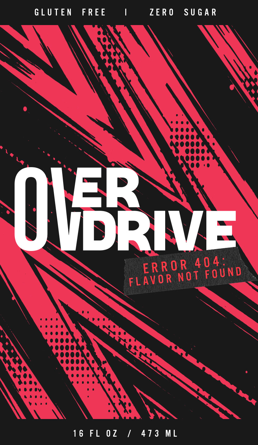
Overdrive is an energy drink brand concept built around energy, movement, and bold visual expression. It exists to deliver explosive energy for those who refuse to slow down, play safe, or stay in the lines. For this project, I wanted to create a brand that stands out through its energetic personality and instantly captures attention. The design direction focuses on leaning into the chaos. Embracing glitch visuals, distorted graphics, and a “push it too far” mentality. I wanted Overdrive to represent the mindset of going past your limits, even if it gets a little unhinged.
THE GOAL
The main objective of this project was to create and design a new energy drink brand. I wanted to communicate its personality through bold typography, color, and graphic elements. I wanted to create a design that would stand out on a shelf while remaining cohesive across packaging and other brand materials.
THE PROCESS
I began by researching existing energy drink brands and exploring how color, typography, and packaging influence a product’s visual identity. I then started looking at what designs currently stand out to me on the wall of energy drinks at the grocery store. I wanted Overdrive to have a recognizable look that felt different from the typical energy drink aesthetic. I explored different flavor names that would fit my brand and started my designs from there. Then, I explored different typefaces for my logo and what typefaces would complement it. I began experimenting with how the different elements could communicate the brand’s energy and personality. Once I established the logo, type choices, and the first can's overall design, I created the other two.
THE OUTCOME
The final result was a bold energy drink design that captures attention and communicates a strong sense of energy. The combination of glitchy abstract elements paired with bold type and elements creates a recognizable visual style that can extend beyond the packaging into additional marketing materials and brand applications.



BEHIND THE SCENES


